01 — The Problem
Every year, the US retirement industry spends $400 million and 14 million hours on plan onboarding — a 12-month process where advisors manually fill 275 fields across 26 forms, each subject to regulatory constraints that can't be automated away. The technology existed to automate most of this work. The design problem was harder: how do you let agents do the work without removing human judgment from a process where a signature carries fiduciary weight?
02 — Who I Was Designing For
Plan advisors and recordkeeper operations staff — domain experts who've processed retirement plans manually for years. They understand regulatory constraints, fiduciary responsibility, and what it means to sign off on something that affects thousands of participants' savings.
"These users don't distrust agents. They distrust opacity in high-stakes decisions."
They're ready to delegate repetitive work. But when their approval carries legal weight, they need to know where the agent's confidence comes from.
03 — The Hard Problem: Confident Delegation
Two constraints, both non-negotiable:
- Agents had to do the work. If advisors scrutinize every agent action, the efficiency gain disappears. You don't solve a 12-month process by adding more steps.
- Advisors still owned the decision. In a regulated financial workflow, a human signature means accountability. Advisors need to understand what they're approving — including what data the agent used and why.
The tension: show everything the agent did, and advisors drown in detail. Hide the reasoning, and you've built a black box in a regulated industry.
My resolution: Design around the decision moment, not the data volume. At each approval point, surface three things — what the agent recommends, where that recommendation came from, and one clear action. Verification is one level deeper, available but not required. Most advisors, most of the time, would trust the source and move forward. Those who needed to verify had a clear path. The UI didn't impose scrutiny on everyone. This enabled confident delegation — advisors could offload the work and still own the accountability.
04 — The Process
Domain Learning Through Subject Matter Experts: I worked with product strategists and domain leads who had deep relationships with plan advisors and recordkeeper staff. Through them I understood what advisors would delegate versus keep, where friction exists, and what 'credible source' means in their context. My PM was my real-time calibration check — if a design decision didn't match how advisors actually work, he'd catch it.
Rapid Design, Stakeholder Feedback, Deliver: Designed rapidly using Google Stitch to generate UI options across 4 core workflows. When I showed the initial screens to stakeholders, the interaction logic and information architecture were sound — but the UI needed aesthetic refinement. The visual language wasn't delivering the polish and confidence that a product for major recordkeeper accounts required.
I brought in a second designer. We kept the exact same interaction model and information architecture. We updated the visual treatment — refined the UI elements, strengthened the typography, elevated the color palette, improved visual hierarchy. Delivered revised screens within 5 days.
When Claude Code became available mid-project, I integrated Figma's MCP server so engineering could reference the design system, components, and flows directly from Figma Dev Mode — no separate handoff document, just a live source of truth accessible to the build team.
05 — The Design Decisions
Decision 1: Distinguishing Agent-Filled from Human-Reviewed
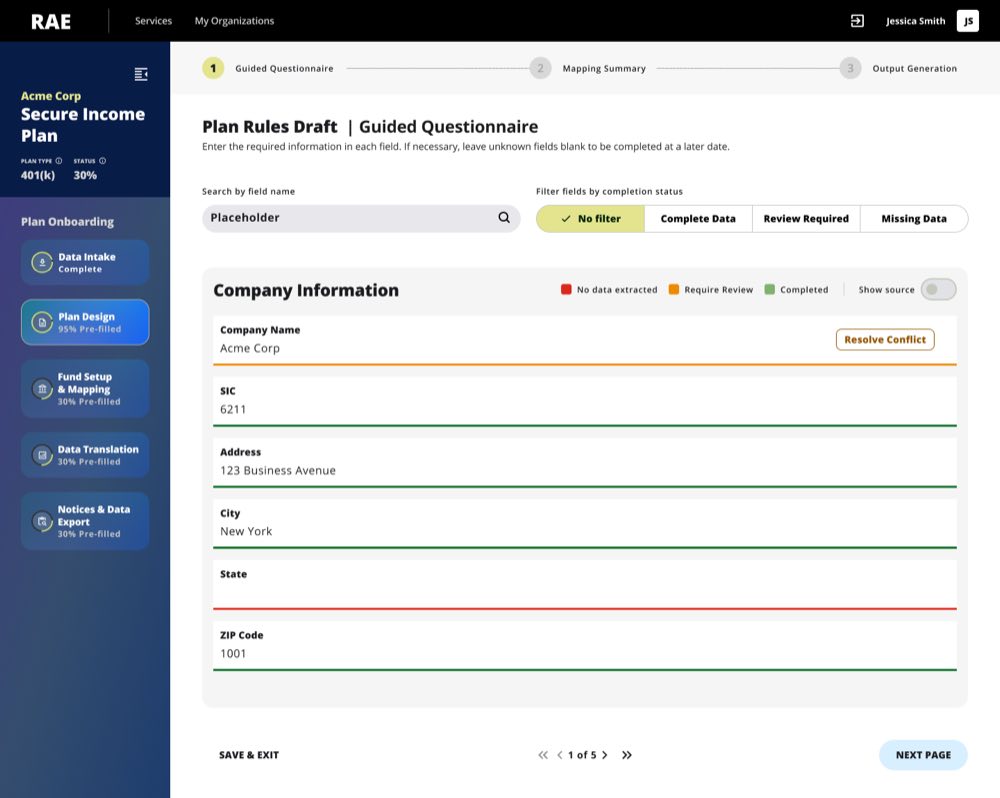
The problem: Advisors need to know at a glance — did I fill this, or did an agent? If an agent did, what source did it use?
The solution: The Upload & Extraction Agent reads uploaded plan documents, investment line-up documents, and payroll files, then pre-fills fields automatically. Auto-filled fields carry a distinct visual treatment with a source badge showing the origin document and section. Human-reviewed fields show the agent's recommendation with one-click access to the source.
Why it matters: Advisors already distinguish their work from others' in their mental model. This makes that distinction explicit and fast — it works with their existing cognitive pattern, not against it.
Decision 2: Progressive Disclosure of Source Data
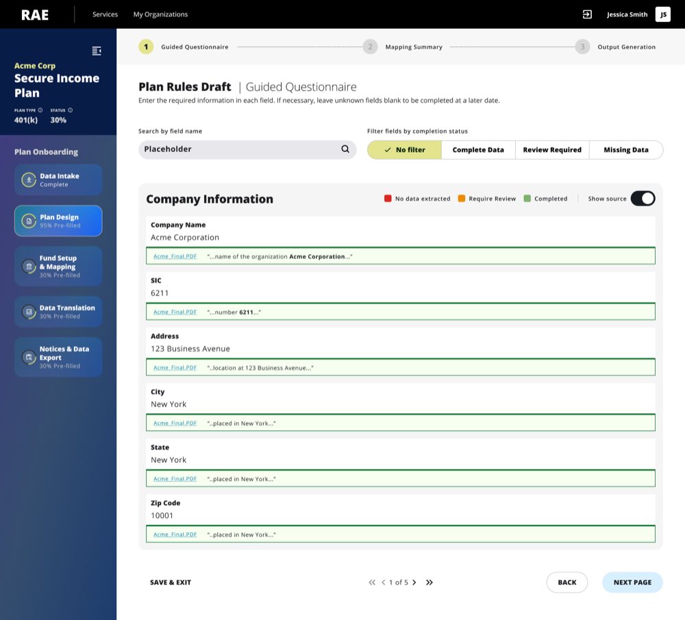
The problem: Advisors needed to verify agent recommendations, but showing full source trails by default created noise.
The solution: Each recommendation from the Upload & Extraction Agent shows a one-line source summary as a clickable link. Clicking reveals the full source trail and confidence data. Two modes: trust and move forward (most of the time) or verify this (when skeptical). The UI doesn't impose verification on everyone.
Why it matters: It assumes advisors are efficient. When they trust the source, they move. When they don't, they have a clear path. This preserves the efficiency gain while protecting the advisor's ability to catch errors.
Decision 3: Surfacing Agent Uncertainty
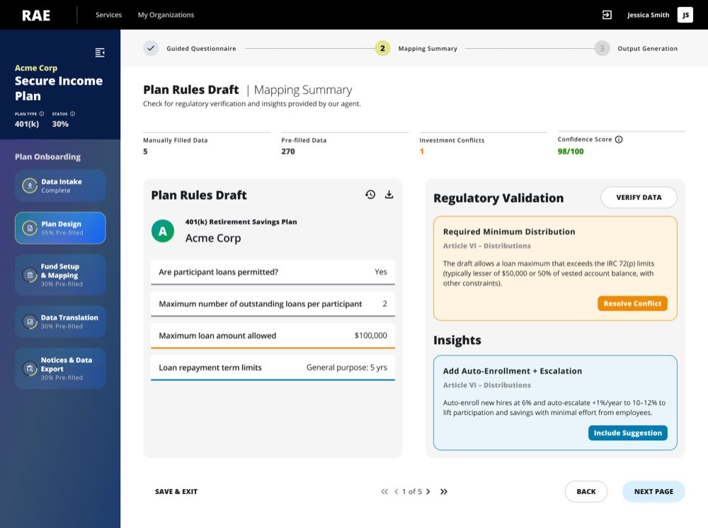
The problem: When an agent encounters conflicting data or low confidence, what does the UI show?
The solution: The Regulatory Agent runs quality assurance across extracted data — cross-referencing fields, flagging regulatory conflicts, and surfacing insights the advisor needs to act on. When it flags a conflict, it surfaces a recommendation with a visible indicator and plain-language explanation. The advisor sees the agent's best read and the reason for doubt. They decide.
Why it matters: Showing limitations honestly builds more confidence than hiding them. Advisors know the system isn't pretending to be certain when it isn't. That transparency is a design feature, not a weakness.
06 — What I'd Do Differently
My early designs showed everything — every source, every inference, full reasoning trails. I was solving for transparency. What I learned is that transparency isn't the same as clarity. If I were starting again, I'd work from minimum necessary visibility upward, rather than stripping back from maximum transparency. Start with the least an advisor needs to approve confidently, then add detail on demand.
07 — The Impact
Transformed a 12-month manual process into an automated workflow.
By automating the extraction and validation of 275 fields across 26 distinct regulatory forms, the agentic UI allowed financial advisors to confidently delegate the manual data entry while retaining absolute fiduciary control over the final approval.